Creating a calm and peaceful atmosphere at home often starts with the colors you choose for your walls, furniture, and decorations. Color has a powerful influence on our mood and can either energize us or help us relax. If you want your living space to feel like a sanctuary, selecting calm colors is key. In this post, we’ll explore practical tips to help you pick soothing colors that promote tranquility and balance throughout your home.
Why Choose Calm Colors?
Calm colors tend to be soft, muted, or neutral shades that don’t overwhelm the senses. They encourage relaxation, reduce stress, and create harmony. Unlike bright or bold colors, calm shades provide a gentle backdrop where you can unwind and recharge.
Some benefits of using calm colors in your home include:
– Enhancing restfulness in bedrooms and living areas
– Creating an inviting and welcoming environment
– Complementing natural light and outdoor views
– Providing versatility for different decorating styles
Popular Calm Color Palettes
Before diving into tips, it helps to know what typical calm colors look like. Some popular options include:
– Light blues and soft greens: These mimic nature and water, often associated with peace and tranquility.
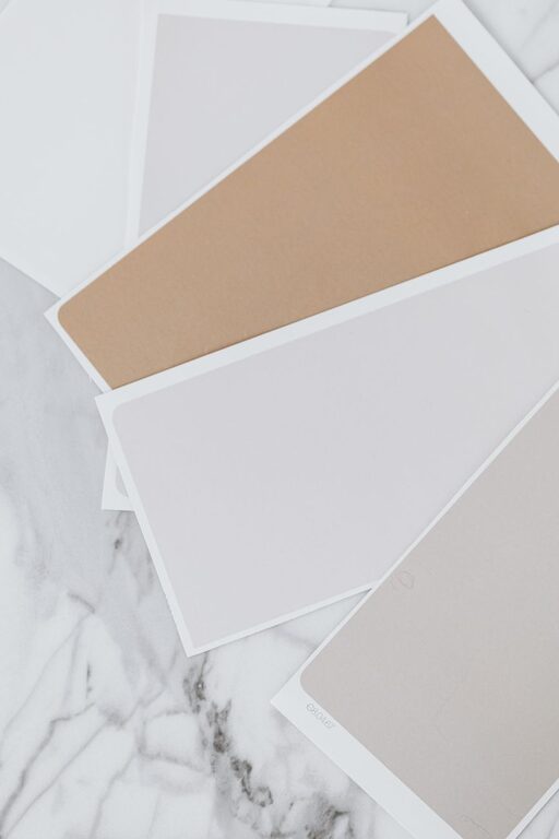
– Warm neutrals: Shades like beige, taupe, and soft browns add warmth without overstimulation.
– Muted pastels: Light lavender, blush pink, or pale peach offer a subtle touch of color.
– Soft grays: A flexible neutral that pairs well with many other colors and creates a modern, serene feel.
Tips for Choosing Calm Colors for Your Home
1. Consider the Room’s Purpose
Start by thinking about what the room is mainly used for. Bedrooms, bathrooms, and relaxation areas benefit most from calm, muted colors that help you wind down. In contrast, kitchens or home offices may handle slightly livelier shades while still maintaining a calm tone.
For example:
– Bedrooms: Soft blues, greens, or grays promote restful sleep.
– Living rooms: Warm neutrals or muted pastels create a cozy, comfortable space.
– Bathrooms: Whites and light blues give a clean, spa-like feel.
2. Use the 60-30-10 Color Rule
To create a balanced look, try the 60-30-10 rule:
– 60%: Main color on walls or large surfaces (choose your calm base color)
– 30%: Secondary color on furniture or rugs
– 10%: Accent color for pillows, art, or decorative items
This approach helps maintain calmness without the space feeling flat or monotonous.
3. Test Colors in Different Lights
Lighting can change how colors appear. Natural daylight brings out the truest tones, while incandescent or LED lighting can add warmth or coolness.
– Test paint swatches on walls at different times of day.
– Observe how artificial lights affect the color in the evening.
– Choose shades that remain soothing in all lighting conditions.
4. Choose Matte or Satin Finishes
Glossy paints can reflect light harshly, which may contrast with the calming effect you’re aiming for. Matte or satin finishes diffuse light softly and add a subtle texture that supports a relaxed vibe.
5. Incorporate Natural Elements
Pair calm colors with natural materials like wood, stone, or woven textiles. These elements blend well with muted shades and enhance the overall feeling of serenity.
For example:
– Light oak furniture complements beige or pastel walls.
– Stone countertops or accents match soft grays or greens.
– Linen curtains or cushions soften the decor and add comfort.
6. Avoid Overly Bright or Highly Saturated Colors
While bright colors can energize, they often disrupt calmness. Avoid bold yellows, reds, or neon tones if your goal is relaxation. Instead, opt for muted versions of these colors if you want to include them.
7. Create Color Flow Between Rooms
Choose calm colors that harmonize well from one room to the next for a cohesive and peaceful home environment. This flow prevents abrupt changes that might feel jarring or chaotic.
For example:
– Use different shades of blue in adjacent rooms.
– Transition from a pale green living room to a light taupe bedroom.
– Keep accent colors consistent throughout common areas.
8. Use White and Off-White Strategically
White and off-white shades can brighten spaces and provide a neutral canvas for other calm colors. They keep rooms feeling open and airy without overwhelming the senses.
Keep in mind:
– Pure white offers a crisp, clean look.
– Creams or ivory add warmth.
– Consider the undertones in whites to match other hues in your palette.
Final Thoughts
Choosing calm colors for your home is a wonderful way to create a peaceful retreat from the busy world. By understanding the moods evoked by different shades and applying these simple tips, you can design spaces that feel balanced, cozy, and inviting.
Remember, your home should reflect your personality and comfort. Take your time testing colors, mixing textures, and tailoring your palette until you find the perfect calm combination for your unique space. With thoughtful choices, your home can become a soothing haven you’ll love to come back to every day.
About the Author